1. Upload an image
Drag a file onto the designated area or select it from your device. Supported formats are PNG, JPG, and SVG.
Upload a photo, logo, or graphic, and the tool will extract up to 12 dominant colors with HEX and RGB codes. Analysis happens locally in your browser.
Every photo, logo, or graphic contains colors that can serve as a ready-made color palette. The extractor analyzes the image and shows which colors dominate - along with HEX codes and RGB values ready to paste into your project.
In practice, this means that instead of manually sampling colors in a graphics application (pixel by pixel), you upload one image and get an organized list of up to 12 colors. This is useful when selecting colors for a website, creating consistent social media graphics, or building a visual identity from existing material.
All analysis happens locally in the browser - the image is not sent to any server.
The whole process takes just a few seconds:
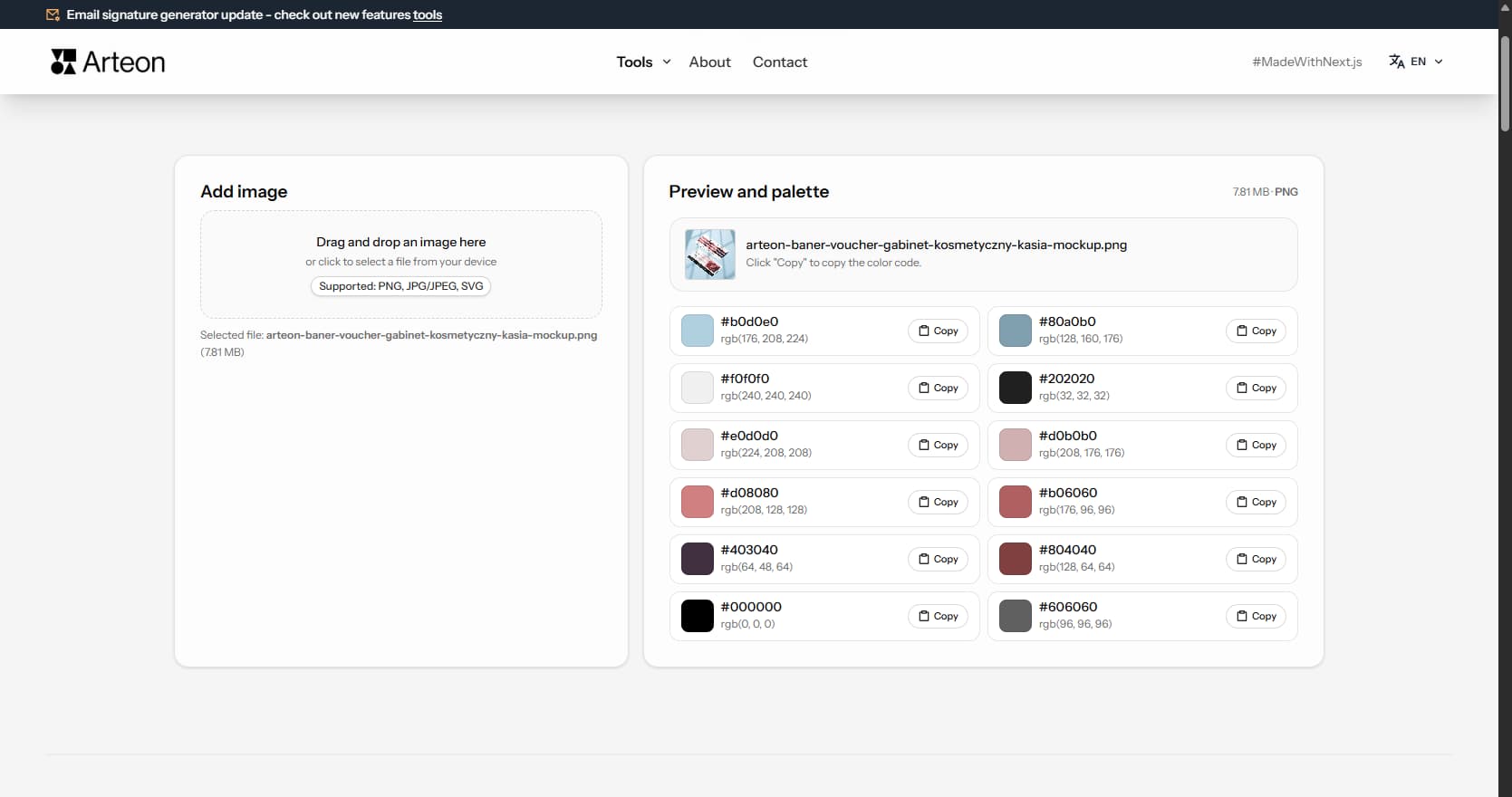
Example colors extracted from a nature image
After uploading an image, the extractor displays a list of dominant colors sorted from most to least prominent. Each color shows its HEX code and RGB value - ready to paste into CSS, Figma, or any graphics application.
The number of extracted colors depends on the image content. A landscape photo will produce a richer palette (8–12 colors), while a simple two-color logo will yield correspondingly fewer items.
The quality of the extracted palette depends on the type of uploaded image:
After uploading a file, the tool performs several steps in the background - all analysis happens locally in the browser:
The image is resized to about 240 pixels wide. This speeds up analysis even for very large photos, without affecting color detection accuracy.
Each pixel is analyzed, and similar shades are grouped together. Two nearly identical blues become one color in the palette.
The algorithm picks colors that cover the largest area of the image. The result is a list of up to 12 colors sorted from most to least prominent.
In PNG files with transparent backgrounds, those areas are not included in the analysis - the extractor examines only visible colors. The entire process typically takes under a second.
Different photo genres produce different palettes. A landscape photo yields earthy gradients - sky blues, grass greens, soil browns and stone grays. A product photo on a controlled background returns precise brand colors with minimal noise. A portrait gives skin tones, wardrobe colors and background hues mixed together.
Food photography tends to produce warm palettes. Golden bread crusts, deep red sauces, green herbs and cream-colored plates form an analogous color range that moves from warm to neutral. Fashion photography varies widely - editorial shoots use bold, saturated tones while minimalist lookbooks return near-monochromatic results in black, white and one accent.
For best results, crop the image to the area that matters before uploading. A landscape photo cropped to just the sunset sky will give you warm oranges and pinks. The same photo with the full frame included will add ground browns and foliage greens. The extractor analyzes what it sees, so controlling the input controls the output.
A moodboard collects visual references that define the look and feel of a project - interior photos, fabric swatches, architectural details, nature close-ups. The image color extractor turns each reference into concrete HEX codes. Upload five moodboard images one by one, note the extracted colors, and look for tones that appear across multiple images. Those recurring colors become your core palette.
Interior designers use this workflow to bridge the gap between physical and digital. A client sends a photo of a fabric they love. The designer uploads it, extracts the dominant colors and uses those HEX codes as the starting point for a website, presentation or social media template. The result feels connected to the physical material because the colors come directly from it.
Web designers apply the same approach when starting a new project. Collect 3–5 reference websites or photographs that match the desired mood, extract colors from each and identify the common thread. A warm, earthy moodboard will consistently return ochres, taupes and olive greens. A tech-forward moodboard will return blues, dark grays and bright accents. The extractor makes this process fast and precise.
The same object looks different under different light. Warm indoor lighting shifts every color toward yellow and orange. Cool fluorescent light adds a blue-green cast. Golden hour sunlight bathes everything in warm amber. The extractor analyzes pixel colors as they appear in the image file, so the lighting in the photo directly affects the palette you get.
Camera white balance settings also change the result. Auto white balance tries to neutralize color casts, but it does not always succeed. A photo shot in tungsten light with daylight white balance will appear very warm - the extracted palette will lean heavily toward orange and brown. If you need accurate brand colors from a product photo, make sure the photo was taken with correct white balance or color-corrected afterward.
Overexposed photos lose color information in bright areas - those pixels become white or near-white and contribute little to the extracted palette. Underexposed photos compress colors into dark, muddy tones. For the richest extraction results, use well-exposed images where colors are clear and distinct. If you only have a dark photo, try increasing brightness in any image editor before uploading.
An extracted palette is a starting point, not a finished system. The extractor may return 8–12 colors, but a typical design project uses 4–5 functional roles: primary color, secondary color, accent, background and text. The first step after extraction is to assign roles - pick the most prominent extracted color as primary, choose a contrasting one as accent and select the lightest tone as background.
Some extracted colors will be too similar to use side by side. Two slightly different greens from a landscape photo serve the same visual role. Keep the one with better contrast against your background and set the other aside. The goal is a palette where each color has a distinct job in the interface or layout.
Once you have a base color from the extraction, you can expand it into a full tonal scale. Copy the HEX code and paste it into the color palette generator to create complementary, analogous or triadic sets. This two-step workflow - extract, then generate - combines real-world color inspiration with mathematical color harmony.
Front-end developers often receive brand materials in non-digital formats - a printed business card, a PDF brochure, a scanned letterhead. The quickest way to get usable color codes is to photograph or screenshot the material and upload it to the extractor. The returned HEX values can go directly into CSS custom properties, Tailwind configuration or design tokens.
When redesigning an existing website, the extractor helps reverse-engineer the current color scheme. Take a full-page screenshot of the old site, upload it, and the tool will show which colors dominate the layout. This gives you a factual baseline - you can see if the old design actually used the brand colors consistently or drifted over time.
The extractor is also useful for verifying that a mockup matches the brand guide. Upload the final design file as a PNG, extract the colors and compare the HEX codes against the official brand palette. Any discrepancy will show up immediately. This quick check prevents color drift before the design goes to development.
No. The tool is completely free and requires no login or registration. The image is analyzed locally in the browser - it is not sent to any server. After closing the page, all data is removed.
The extractor pulls colors from an existing image - it analyzes a photo and shows which colors dominate in it. A color palette generator works the other way: you provide one base color, and the tool creates harmonious sets based on color theory. Both tools complement each other - you can extract a color from an image and then use it as a base in the palette generator.
The tool extracts up to 12 dominant colors. The exact number depends on the image content - if a graphic has only two colors (e.g., a simple logo), the result will contain fewer items. Colors are sorted from most to least prominent.
Supported formats are PNG, JPG (JPEG), and SVG. PNG files with transparent backgrounds give better results because transparent pixels are skipped during analysis - the tool focuses on the colors of the object itself.
Each color is displayed with its HEX code (e.g., #2C5F2D) and RGB value (e.g., rgb(44, 95, 45)). The code can be copied to the clipboard and pasted directly into CSS, Figma, Photoshop, or any other graphics application.
Currently the tool allows copying colors individually - next to each color there is a button that copies the HEX code to the clipboard. The copied code can be immediately pasted into Figma, Photoshop, CSS, or any other application.
Have an idea for a new feature, found a bug, or want to suggest another tool that would make your work easier? Write to us – we respond within 24 hours.
Resize, crop and convert your image. Ready-made formats for social media, circular avatars, export to JPG/PNG/WebP.

Check title and description length in pixels. Live Google preview and optimization tips.
Convert PNG files to JPG in your browser. No file limits, no signup, no server uploads.

Create a complete favicon.ico set for your website from one image. All required sizes, no login.
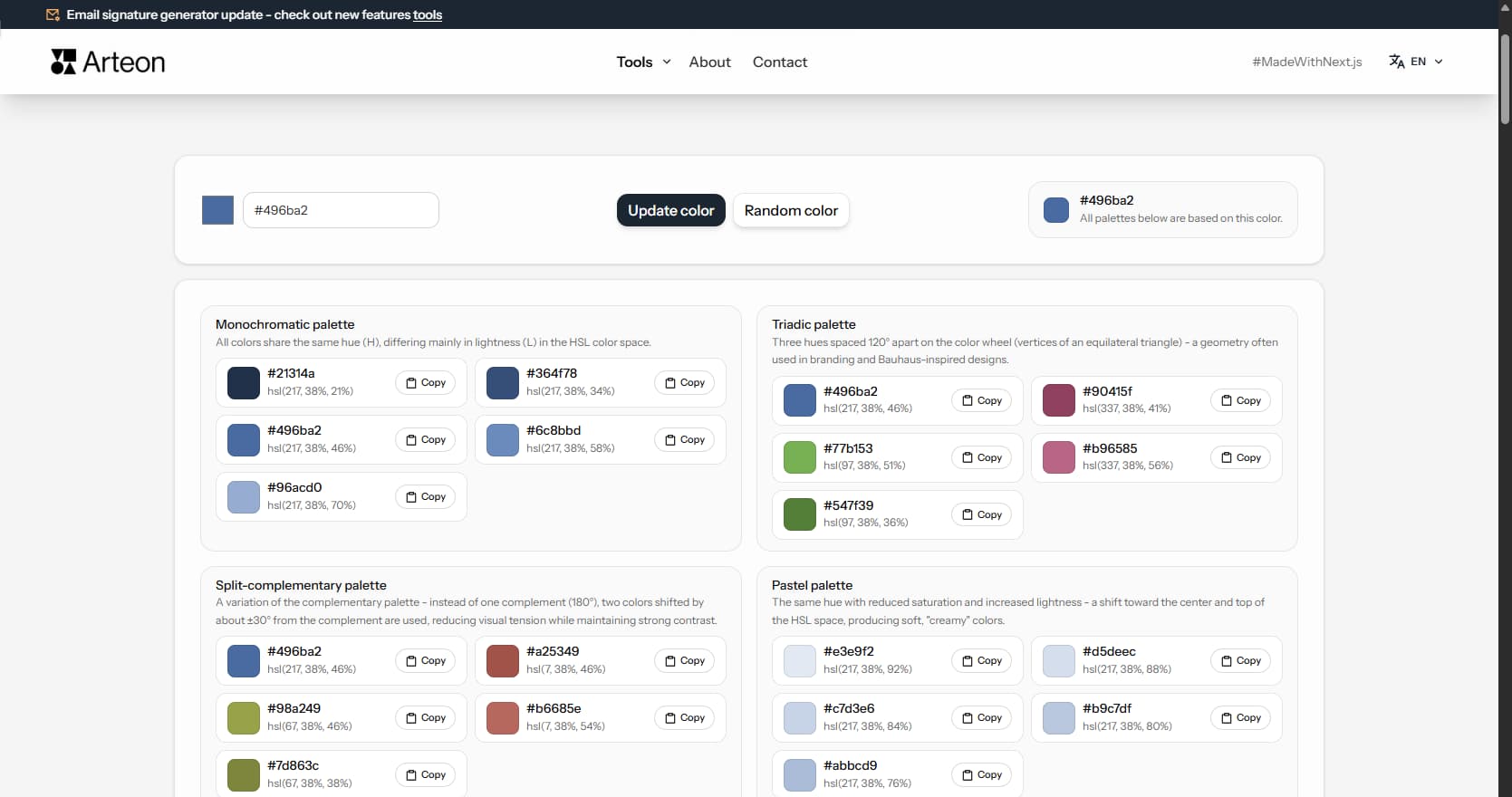
Generate 9 palettes from one color: monochromatic, complementary, triadic and more. HEX codes.
Convert WebP files to universally compatible JPG. Works in every app and platform.
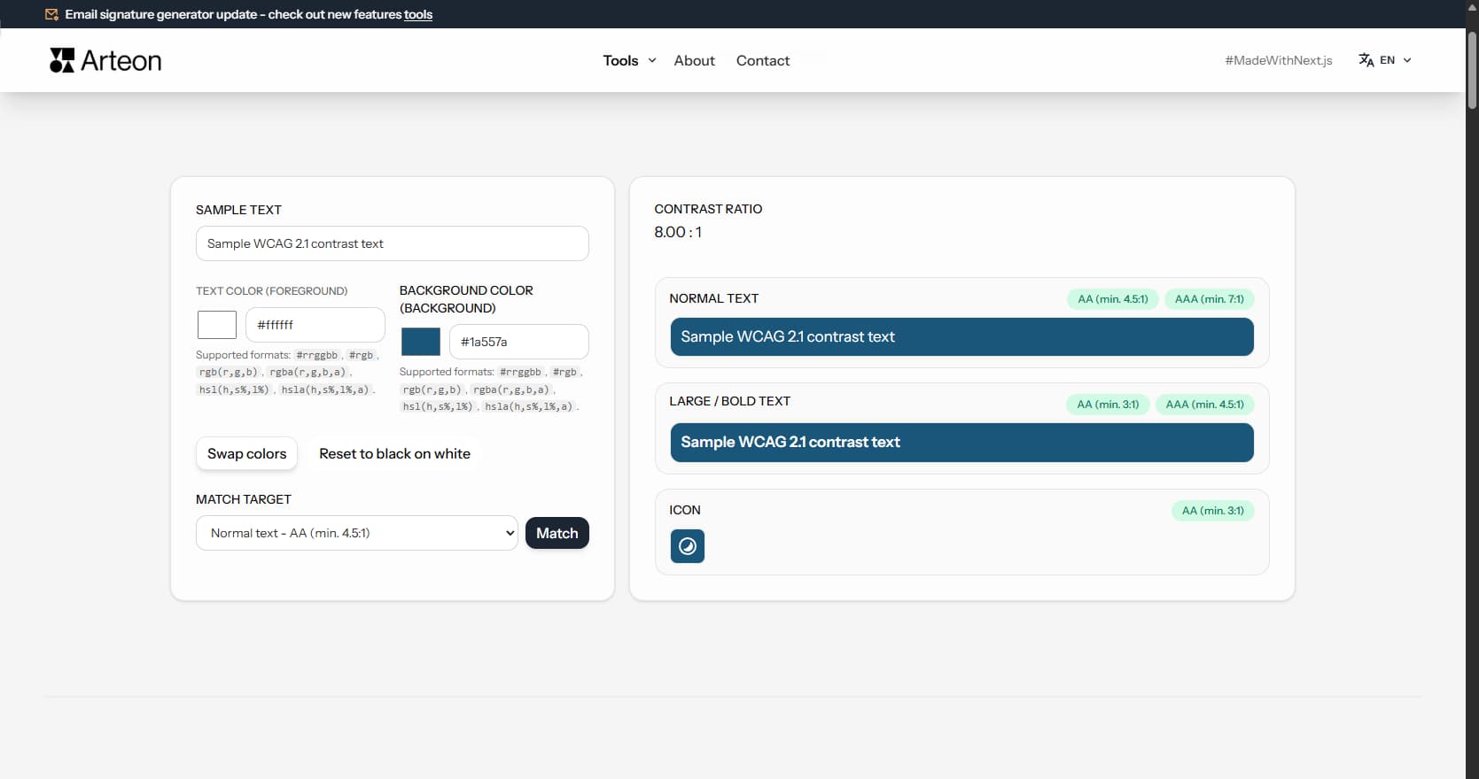
Check text and background contrast per WCAG 2.1 AA and AAA. Automatic color correction.
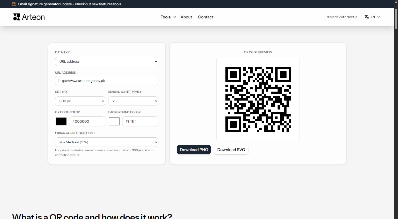
Create a QR code for a website, vCard business card or print. Export PNG and SVG, no registration.
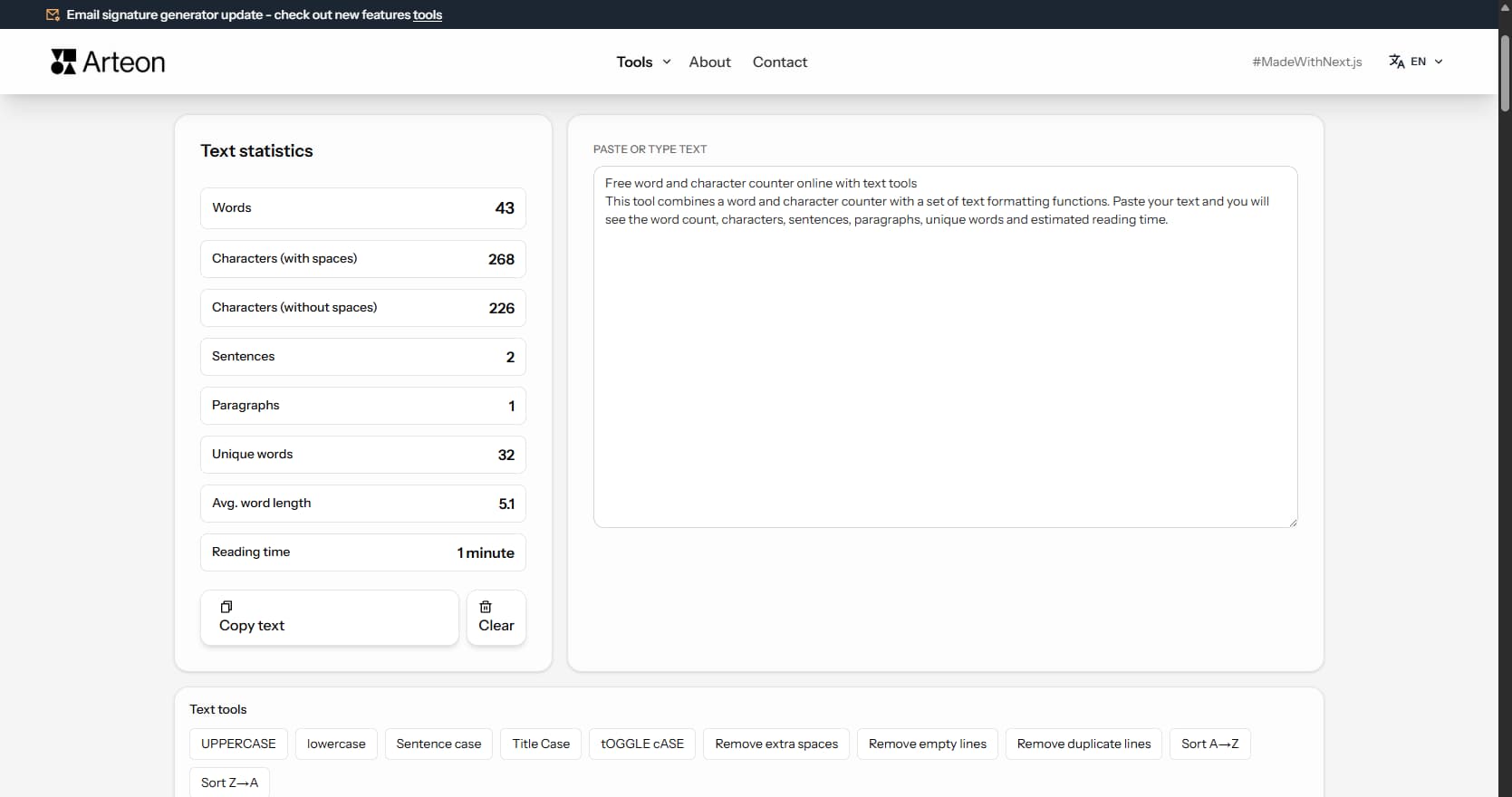
Count words, characters, sentences and reading time. Check readability with the Flesch-Kincaid score.
#2C5F2D
#97BC62
#F2E8CF
#D4A373
#6B705C
#A5A58D