1. Enter the text color
Type a color code (e.g., #333333) in HEX, RGB, or HSL format - or pick a color from the color picker.
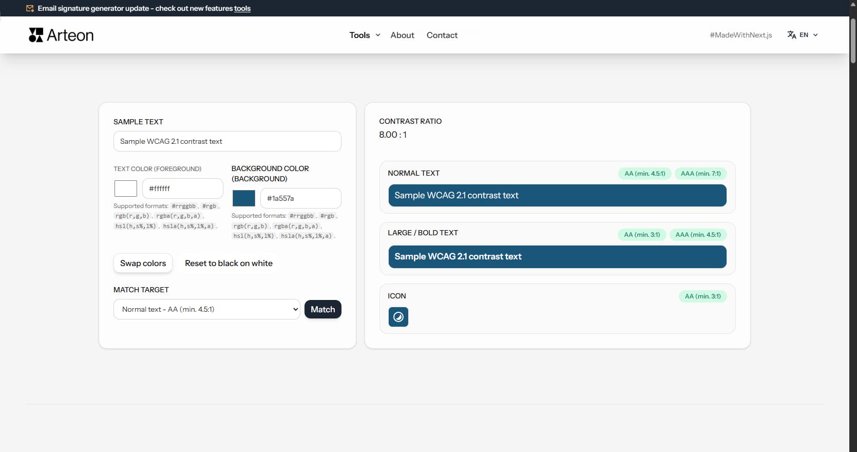
Enter a text and background color, and the tool will show whether contrast is sufficient. Calculations are based on the international accessibility standard WCAG 2.1, which defines minimum contrast values for different content types.
Readability is the luminance difference between the text color and the background color. The greater the difference, the easier it is to read the text. Too low contrast makes content hard to read - especially for people with vision impairments, older adults, or in difficult lighting conditions (e.g., on a phone in direct sunlight).
According to the World Health Organization (WHO), approximately 2.2 billion people worldwide have some form of vision impairment. In addition, millions have color blindness (about 8% of men and 0.5% of women), and many more experience age-related vision decline.
The tool calculates the contrast ratio using the formula specified in the WCAG 2.1 (Web Content Accessibility Guidelines) - international digital accessibility guidelines. The result allows an objective assessment of whether colors are readable enough, regardless of monitor settings or individual color perception.
Checking readability takes just a few seconds:
Hexadecimal format - the most common in web design. Starts with # and contains 3 or 6 characters (digits 0-9 and letters A-F).
#fff - white (shorthand)#ffffff - white (full form)#1a73e8 - blueContrast ratio
8.59:1
Normal text
Sample normal text
Large text
After entering colors, the tool displays results in three sections:
Green indicator means the requirement is met. Red indicator means contrast is too low and needs improvement.
The tool shows the contrast ratio on a scale from 1:1 (no contrast) to 21:1 (maximum contrast - black on white). The result is compared against thresholds defined in the WCAG standard:
Level AA is the minimum required by digital accessibility regulations in many countries, including the EU Web Accessibility Directive. Level AAA provides better readability but is not always practical to achieve for all elements.
If contrast is too low, you don't need to search for the right color by trial and error. The Match feature automatically finds a text color variant that meets the selected contrast threshold.
How matching works:
The algorithm preserves the hue and saturation of the original color, changing only the lightness. The suggested color stays consistent with the visual identity while meeting the accessibility standard.
| Level AA (minimum) | Level AAA (enhanced) | |
|---|---|---|
| Normal text - min. 4.5:1 | ✓ | ✓ |
| Normal text - min. 7:1 | — | ✓ |
| Large / bold text - min. 3:1 | ✓ | ✓ |
| Large / bold text - min. 4.5:1 | — | ✓ |
| Icons and UI elements - min. 3:1 | ✓ | ✓ |
| Required by EU Web Accessibility Directive | ✓ | — |
| Required by US ADA / Section 508 | ✓ | — |
| Required by UK Equality Act 2010 | ✓ | — |
| Recommended for key content | ✓ | ✓ |
Check the color format. A HEX code should start with # and contain 3 or 6 characters (e.g. #fff or #ffffff). For RGB, make sure values are separated by commas and fall within the 0-255 range.
When the background and text have similar lightness in the same hue, the algorithm may not find a variant that meets the requirements without changing the hue. In this case, consider changing the background color or choosing an entirely different text color.
The browser color picker only supports the HEX format without transparency. If you enter a color in RGBA or HSLA format with transparency, the picker will show only the color part (without alpha). Contrast calculations still take transparency into account.
Readability matters everywhere someone needs to read text or recognize a UI element:
Color blindness affects about 8% of men and 0.5% of women. People with color blindness may have difficulty distinguishing certain color pairs, even if the luminance contrast is sufficient.
Most common types of color blindness:
This tool checks luminance contrast, which is important for all users. However, when designing, it is also worth avoiding problematic color combinations (e.g., red text on a green background) and not relying solely on color to convey information - use shapes, icons, and text as well.
Color contrast is not just a best practice - it is a legal requirement in many countries. Here are the key regulations that reference WCAG contrast standards:
Regardless of your location, meeting WCAG 2.1 Level AA contrast requirements protects your organization from legal risk and ensures your content reaches the widest possible audience.
The contrast ratio uses relative luminance - how bright a color appears to the human eye. The WCAG 2.1 formula is:
(L1 + 0.05) / (L2 + 0.05)
L1 is the luminance of the lighter color, L2 of the darker. Luminance is derived by converting sRGB to linear light, then weighting channels: 0.2126 × R + 0.7152 × G + 0.0722 × B.
The result ranges from 1:1 (identical) to 21:1 (black on white). This removes subjectivity - the ratio stays the same regardless of monitor, lighting, or personal vision.
WCAG 2.2 (October 2023) adds criteria for focus appearance and dragging movements but does not change contrast thresholds. Success Criteria 1.4.3 and 1.4.6 remain identical to WCAG 2.1.
WCAG 3.0 is an early draft proposing APCA (Advanced Perceptual Contrast Algorithm). APCA accounts for font size, weight, and polarity (light-on-dark vs dark-on-light) for a more accurate score.
WCAG 3.0 is years from becoming a recommendation. For now, WCAG 2.1 AA (4.5:1 / 3:1) remains the legal standard worldwide. This tool uses the current WCAG formula.
These patterns appear frequently in web design and often fail WCAG checks:
A contrast ratio is a measure of the luminance difference between two colors. The scale ranges from 1:1 (no difference - e.g., white text on white background) to 21:1 (maximum difference - black text on white background). The higher the ratio, the easier it is to distinguish text from the background.
For normal text, the minimum is 4.5:1 (Level AA). For large text - headings from 18pt or bold text from 14pt - 3:1 is sufficient. For icons and UI components, 3:1 is also required. These thresholds ensure readability for most users, including those with impaired vision.
The checker tests luminance contrast, which matters for all users, including those with color blindness. However, color blindness is a color perception issue, not a luminance issue - so in addition to contrast, avoid problematic color pairs (e.g., red text on green background) and don't rely solely on color to convey information.
Personal color perception depends on monitor settings, room lighting, and individual visual abilities. WCAG is based on an objective mathematical formula that accounts for various vision impairments. A color readable on one screen may be unreadable on another or for a different person.
Not always. Level AA (4.5:1 for normal text) is the minimum required by accessibility regulations in the European Union. Level AAA (7:1) provides better readability but is harder to achieve. For critical content - warnings, safety instructions - consider aiming for AAA.
WCAG (Web Content Accessibility Guidelines) is an international set of web accessibility guidelines developed by the W3C organization. It defines, among other things, minimum color contrast values, heading structure, keyboard support, and other requirements that make websites accessible to people with various disabilities.
In a browser (Chrome, Firefox, Edge) you can open developer tools (right-click > Inspect). In the Styles tab, you can see the colors used on the page. Alternatively, browser extensions like ColorZilla let you pick the color of any element without digging into code.
Most important: text on the main background, text on banners and colored sections, buttons (text color and button background relative to page background), links, and icons. Pay special attention to elements that appear on different backgrounds depending on the section.
Yes. The Americans with Disabilities Act (ADA) and Section 508 of the Rehabilitation Act require digital accessibility. Courts have increasingly ruled that commercial websites must be accessible under ADA Title III. The standard referenced is WCAG 2.0/2.1 Level AA, which includes minimum contrast ratios of 4.5:1 for normal text and 3:1 for large text.
WCAG 2.0 (2008) established the original contrast requirements. WCAG 2.1 (2018) added criteria for mobile accessibility, cognitive disabilities, and low vision. WCAG 2.2 (2023) adds further criteria but does not change the contrast ratio thresholds. The contrast requirements (1.4.3 and 1.4.6) remain the same across all versions.
Yes. The tool checks the contrast ratio between any two colors regardless of which is lighter. For dark mode, you would typically enter a light text color and a dark background color. The same WCAG thresholds apply - 4.5:1 for normal text (AA) and 7:1 (AAA).
The darkest gray that still passes WCAG AA on pure white (#ffffff) is #767676, which gives exactly 4.54:1. Anything lighter - for example #999999 at 2.85:1 - fails. For AAA compliance (7:1) you need at least #595959.
If you sell products or services to consumers in the EU, yes. The EAA (Directive 2019/882) took effect in June 2025 and extends accessibility obligations beyond public sector to private e-commerce, banking, transport, and media. It references the EN 301 549 standard, which maps to WCAG 2.1 AA - including the 4.5:1 and 3:1 contrast thresholds checked by this tool.
Pick the lightest area of the background where text appears and test against your text color. That worst-case spot determines whether the combination passes. For gradients, check both endpoints. For images, the safest approach is to add a solid or semi-transparent overlay behind the text.
APCA (Advanced Perceptual Contrast Algorithm) is a proposed replacement for the current WCAG contrast formula, developed as part of the WCAG 3.0 draft. It considers font size, weight, and text polarity for a more perceptually accurate score. However, WCAG 3.0 is not yet a W3C Recommendation and no law currently references APCA. Until it is finalized, use the WCAG 2.1 formula - which is what this tool calculates.
Have an idea for a new feature, found a bug, or want to suggest another tool that would make your work easier? Write to us – we respond within 24 hours.
Resize, crop and convert your image. Ready-made formats for social media, circular avatars, export to JPG/PNG/WebP.

Check title and description length in pixels. Live Google preview and optimization tips.
Convert PNG files to JPG in your browser. No file limits, no signup, no server uploads.

Create a complete favicon.ico set for your website from one image. All required sizes, no login.
Generate 9 palettes from one color: monochromatic, complementary, triadic and more. HEX codes.
Convert WebP files to universally compatible JPG. Works in every app and platform.
Check text and background contrast per WCAG 2.1 AA and AAA. Automatic color correction.
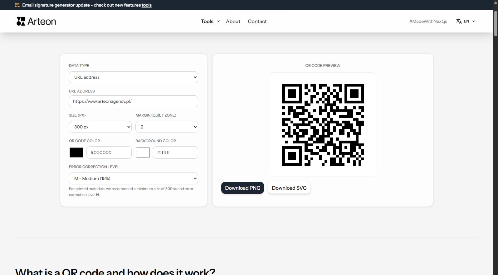
Create a QR code for a website, vCard business card or print. Export PNG and SVG, no registration.
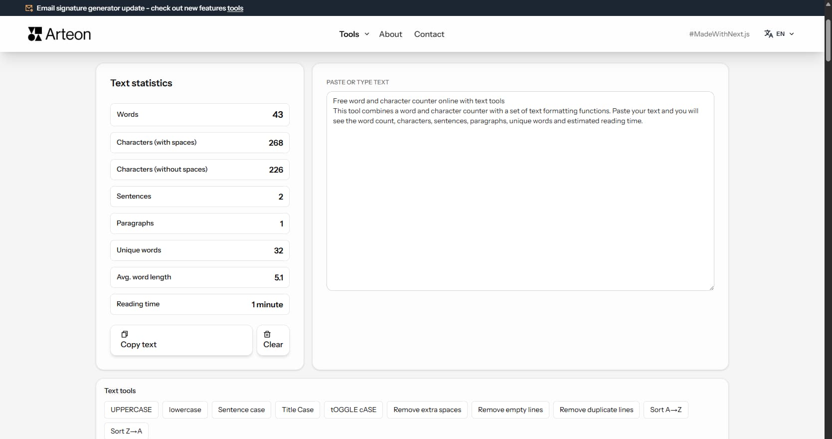
Count words, characters, sentences and reading time. Check readability with the Flesch-Kincaid score.
Contrast ratio
21.00 : 1
Normal text
Sample WCAG 2.1 contrast text
Large / bold text
Sample WCAG 2.1 contrast text
Icon